A Scrapbook? An Altered Book? A Work Book? Outsider Art? Something Else?

One trait that unites book people (bibliographers, typographers, librarians, book conservators, graphic designers, collectors, book historians, printers, booksellers, curators, papermakers, bookbinders, etc…) is an emphasis on using an accurate terminology when describing aspects of the material book. The problem is that these sects have developed their own distinct usage, which sometimes overlap, and sometimes don’t. For example, the term “text block” means something entirely different to bookbinders and printers.

Booksellers and bibliographers often refer to Carter’s ABC for Book Collectors. Conservators are largely adopting the Language of Bindings from Ligatus, which is supposed to be available as a book from Oak Knoll soon. Binders usually use the lingo of the workshop where they learned the craft from. Printed resources include Etherington’s Bookbinding and the Conservation of Books and Glaister’s Encyclopedia of the Book.

Most of us learn our terminology haphazardly. Considered historically, prescriptive attempts at linguistic change often fail, even if what they propose is more rational or accurate. Given improvements in text searching, and the ease of taking and disseminating digital images, I wonder if the need to use a strict terminology is as important as it once was.

Top Edge. B.F. Tefft, Webster and his Master-Pieces. Auburn and Buffalo: Miller, Orton & Mulligan, 1854. My Collection.

That said, I recently purchased a book that does not fit neatly into any existing descriptive framework that I’m familiar with. The distortions on the top edge of the book caught my attention when I looked at it in the store. Then I noticed the extremely crude backing, making it a useful “how-not-to” example when teaching. Many sections have two reverse folds! Then again, these reverse folds may have helped lock the sections into place, given the typical detaching of the spine linings: note the pages are not falling out at the foreedge. The binding itself is in good shape considering wear, even with an additional quarter inch or so of added material. The case binding structure is quite adaptable to different text block thicknesses.

But the real reason I bought it was for the neatly glued in newspaper clippings of quilt patterns on the first twenty-four consecutive recto leaves. As in the example below, they typically completely cover the entire text block. The high quality of the text paper has helped buffer the newsprint, preserving it, though at the expense of the host: note the extensive staining on page 92, again quite typical.


Typical layout of four patterns per page. B.F. Tefft, Webster and his Master-Pieces. Auburn and Buffalo: Miller, Orton & Mulligan, 1854. My Collection.

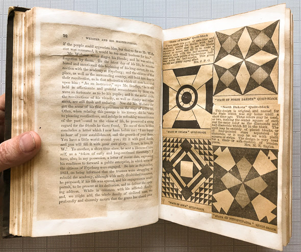
It is not unusual for books to become repositories for all sorts of things: plants, leaves, receipts, scribbled notations, and the occasional hair-on mouse skin. I’m guessing the quilt patterns were added in the early 20th century. The additions cover and obscure the original text.

What to call it?  Gary Frost, I think, would consider this in his broad rubric as an “intervention”. While it is certainly an altered book, I don’t think it has the artistic connotation that the phrase usually implies.  It is not really a commonplace book, or an artist’s book. It is not extra-illustrated. It is more than a scrapbook, since the additions change the original book into something else.

Originally the book was about Daniel Webster, who created the first American dictionary, and a dictionary documents the recorded usage of words. This particular copy was altered in a way that obliterates the text in order to become a reference for quilting. Even through there is some text on the quilting patterns, images dominate. Likely unintentionally, this book is a physical manifestation of the conflict between text and craft, the book learning verses practical activities, the head and the hand. How are books used? More than reading, it seems.

*****

While rereading this post, and looking through the book again, I noticed at least 22 pages near the end with pressed plants. Most seem to be intentionally arranged, resembling marginalia. or in this case the title page of the Doves Bible. Hmmm.

One of over 22 pressed plants. B.F. Tefft, Webster and his Master-Pieces. Auburn and Buffalo: Miller, Orton & Mulligan, 1854. My Collection.

Looking At Pictures, Looking At Books

The Metropolitan Museum of Art, NYC,  is currently exhibiting ‘Looking In:  Robert Frank’s The Americans‘. (1) The first edition of this book is the title that I have worked on the most over the years, currently five copies.  The reasons are  simple– the original Grove Press edition was perfect bound, so the pages are generally detached, or detaching. (2) When this is coupled with the fact that a first printing in good condition sells for up to $20,000, it becomes economically advantageous for the owner to have the book conserved.  I even had a magnesium die made from the title page for stamping the exterior of the drop spine box, since I tend to see this book every couple of years. Since I have spent many, many hours looking at this book, I was curious to see how I would interpret the images in a museum.  I also think this is the first time I have seen all the images from a book displayed  in a gallery.

americans die

Above is a magnesium die, reproduced photographically from the title page, used for hot stamping.

What follows are some haphazard observations on the differences between interpreting images in books verses looking at photographs in gallery setting, tempered by my experience as a conservator. (3)

Overall, there was more a sense of the similarity of the experience, rather than huge differences, in reading the book or looking at the images in the gallery. Perhaps it is because I’m already used to seeing this book in single sheets, rather than intact.  Perhaps it is because the exhibition follows the exact chronology for the 83 images. Maybe is because there is virtually no text in the book, thus reducing the dichotomy between looking and reading. The sequence of the book has always puzzled me a bit.  They aren’t arranged chronologically, thematically, narratively or even with a clear sense of formal relationships.  In fact, as I have spent many, many hours removing traces of deteriorated adhesive from the spine edges of the pages, they often tend to get out of order.  Viewing the images out of order reinforces the impression that it is not in the sequencing that its power lies, but in the massing of the images coupled with a sense of disorder, that creates this powerful, poignant snapshot of America.

Gallery viewing is public, but viewing books generally takes place in private, with the reader able to choose the pace of their viewing.  Typical of a busy museum, especially when looking at smaller format images, I was forced to stand in a line and everyone tended to move along at the same rate.  If you got tired of looking at the image in front of you, you could look back at the previous one or ahead to the next. The book, however is laid out with one image on the recto, and a simple title, often nothing more than a place name, on the verso of the previous page.  Each image in the book is encountered in isolation, and is related to the previous one only by memory, not active viewing. The layout of the images mirrors the subject of the images as well– the often mentioned pervasive loneliness and sense of isolation that Frank documented.

One aspect of Frank’s work that came through more forcefully in the gallery setting was his use of reflections, shooting through curtains, windows, etc.  The fact that the photos were framed in glass, with its own reflections, and the verticality of the picture plane emphasized this.  I interpreted the photographs more like windows, rather than like portraits in the book, both because of their verticality and large size. Many were much larger  (some impressively large for 35mm)  than the reproductions in the book, and the size varied from image to image.  I suspect each photo was printed as large as he could, and they were printed at various times during the past decades.  The regular size of the images in the book, albeit with some variation in horizontal and vertical orientation, tends to reinforce the homogeneous nature of this tour through America. (4)

I am used to looking at this book through my “conservation eyes”.  When viewing the book during conservation treatment, I generally tend not to “look” at it as a whole, but only look at the small area of damage that I am treating.  Even when I sleep on it, or step back and try to assess the whole, the areas where I have devoted so much attention to continue to beckon. Sometimes, when I’m looking at art,  I catch myself looking at a repaired area of an object, or some damage, or how it is mounted, rather than trying to appreciate it as an artistic experience.  I think it is a bad habit, possibly dangerous, in the sense that it forces my perception onto very small details, possibly at the expense of a more holistic interpretation.    When I look at the book, memories of what I treated, what was repaired, etc. constantly resurface and interfere with the intent of the artist.

But after viewing the exhibition, the book form beckoned– this time a 2008 facsimile for sale in the  museum shop,  with sewn signatures, for only $39.95.

americans sewn

NOTES

1. J. Hoberman has a solid review of the show in The Village Voice which places the book in the context of late 1950’s American culture.

2. Take a close look at open first edition displayed at the beginning of the show, in the middle of the case.  Notice that the top and bottom of the page displayed is detaching. Heads up to whoever is de-installing this case- close this book very, very carefully! The glue is already very brittle.

3.  I’m going to leave aside a discussion of the most obvious difference, the difference in the visual qualities of reproduction.  Gelatin silver photographs and offset printing look quite different!

4. Differences in  various editions of the book also change the reading. Towards the end of the show, there was a case containing three various editions of the book, all open to the same image to allow easy comparison. Needless to say, the print quality varied quite a bit, and these differences influence how the images are interpreted.

Smuggler’s Bible

For reasons unknown to me, there are a number of these late 18th C. French bindings that have been converted into smuggler’s bibles.  The stamping on the front cover was done at a later date, and the inside of the textblock seems to have been edge glued, and the back flyleaf used to line the edges.  The bottom is the back board pastedown.  I always wonder what happened to the bulk of the text– thrown away or burned, most likely.  

So if I am “reading” this book correctly, with little or no text, it is the materials and the structure of the binding that give it meaning.  In a way, this book is a eloquent example of how a conservator approaches a book.   Firstly, through the lens of the history of technology, it is the physical substrates that support and protect the text that are documented, analyzed and conserved.   Secondly, we have not time, interest  or are unable to read the language of most of the books we work on.  Do we even need the text?

But this book also demonstrates how the brutal alteration of an artifact can distort our understanding of history.   I’m very interested in late 18th C. French bookbinding, and even though there are many extant examples, each one that is lost  distorts our understanding of the total production and subtle workshop variations. It is that it is very difficult to determine when this book was altered, so it gives the unscrupulous an easy excuse of saying they bought the book in this condition.  The market currently values destroyed or altered books such as this more than an intact volume. 

There is even a company called “Secret Storage Books” that currently makes new versions.  If I were being more stringent with my own ethics, I guess I shouldn’t have purchased this book, since it encourages more of them to be made.  

Octave Uzanne, writing in 1904, in The French Bookbinders of the Eighteenth Century writes: “‘Sham books’, simple wooden boxes, and sometimes mere mouldings, covered with gauffered and gold-tool leathers, with which they filled the empty shelves of a pretentious library, or with which they garnished the doors.”  The books below, however are real books that have been made to resemble the sham books he talks about.


18th-french-cover                  


french-safe


Jane Eagan kindly sent this image of a similar book she owns.

eagan2


eagen-book2


On the 24th of March, 2009 I was watching Looney Tunes historic Chuck Jones animation, and from 1939 an 8 minute short titled “Sniffles and the Bookworm” featured a smuggler’s bible.  Watch the book on the bottom right.  I barely had time to grab my camera, so I missed a better shot earlier in the movie.

jones


jones2