Andrews, William Loring. Bibliopegy in the United States and Kindred Subjects. New York: Dodd Mead and Co., 1902, x.
It is well worth spending some time with the illustrations in Loring’s Bibliopegy. The online version gives a sense of them, but can’t capture the detail found in the book. Some are printed with two or more plates, one for the leather and one to reproduce the gold tooling. Others are photogravure. All are spectacular.
The text is sometimes of interest, especially Loring’s “explication” of the bookbinding section in Hazen’s 1837 Panaroma. He considered it the first treatise on American Bookbinding, although we now know most of it is recycled from earlier English Books of Trades. Even Nicholson’s 1856 Manual of the Art of Bookbinding, now generally considered the first American Bookbinding manual, is largely based on earlier English sources. As Sid Huttner notes in the Garland reprint introduction, “Little (one is tempted to say, if any) of Nicholson’s text came first from his own pen”.
Bibliopegy is a nineteenth century term for bookbinding. I like the way it sounds. A Guild of Bibliopegists? Or too pretentious?
Loring’s book is beautiful and neatly bound. But the paper case structure doesn’t have a joint groove and most copies I’ve seen, including mine, are tearing at the head and tail. The cover boards hit the thick spine piece, creating a levering action that tears the covering paper. Are the stakes for the binding higher when the book is about bookbinding? Can this bibliopegist admit a weakly backed book is still desirable?
My copy. Each time the book is opened the cover paper splits a little more. The gold tooled line to the right on the printed red one hides the join of the three separate pieces of paper between the spine and the boards Andrews, William Loring. Bibliopegy in the United States and Kindred Subjects. New York: Dodd Mead and Co., 1902,
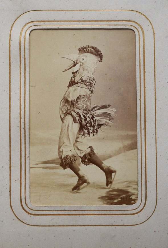
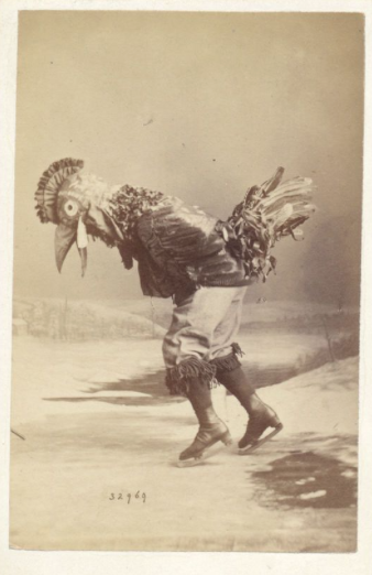
Private Collection. The back: James Inglis / Photographer / Montreal.
Laura Cunningham, Assistant Conservator, Economic Development & Culture, Museums & Heritage Services, City of Toronto, found some other dancing chicken images from the same shoot:
It is easy to get paint from Semple: my order arrived from England in about 10 days, and the price and shipping are at cost according to Semple, around 25 bucks.
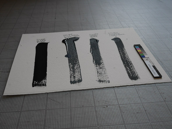
To test, I compared it with some of my usual Golden Acrylic Carbon Blacks. I squeezed a large dollop, then using a new dry brush for each one dragged it down in one stroke on Arches Watercolor paper.
L – R: Stuart Semple’s Black, Golden Fluid Acrylic Carbon Black, Regular Golden Carbon Black, and Golden Airbrush Carbon Black.
In this image, with little reflected light, they don’t look all that different. But in real life Stuart Semple’s Black is significantly more matt, almost indistinguishable from a pure finely ground pigment. The surface is non-friable but oils from fingers can remain the surface, making it look less black. Even where the paint was thick, it cracked and remains matt, unlike the thick areas of the Golden Fluid that show a reflection from their glossy surface. The paint comes in a bottle and has a viscosity similar to the Golden Fluid Acrylic, though more heavily pigmented.
L – R: Stuart Semple’s Black, Golden Fluid Acrylic Carbon Black, Regular Golden Carbon Black, and Golden Airbrush Carbon Black. Specular light.
When viewed with specular light, the difference is amazing, even in the image. Areas where the Golden paint is thin, there is still a slight sheen from the acrylic medium, making it look less black. Semple’s Black is quite similar to the AIC PhD Target black on the far right.
The only bad news is that Semple doesn’t reveal what the binder is, what the pigment is, what the color coordinates are, or how much light it absorbs.
However, this is a cool project which uses the sale of art materials as a artistic statement. It could be interpreted as disgust against the gluttony of the 1% by targeting a single pig, Anish Kapoor. By selling it at cost it is also a comment on the history of precious materials in art interpreted as value. It is similar to a Banksy prank, an artist who is interested in interactional art outside the white cube; art which intersects with the real world in unexpected and exciting ways. Semple investigates the weird intersections of materials/ capital/ art, then reinserts this back into the making of art, ouroboros like.
But will the fact this is a functional and useful product preclude it from being considered as “Art”? This question interests me quite a bit, as I am thinking about some toolart projects which straddle these deeply delineated and difficult to cross boundaries.


