Below is an interview by Brea Black originally published in the Guild of BookWorkers (GBW) Newsletter No. 245, August 2019, pp. 16-18. It outlines many aspects of book and tool work I’ve been involved with in the past 30 years.
If you are not a member of GBW you should be! There are usually a number of interesting articles in the newsletter, a (sort of) annual journal, workshops held around the US hosted by local chapters, and an annual conference.
I will be vending tools at this year’s Annual Standards of Excellence, October 24 – 26, in Philadelphia, PA. In addition to new tools, I plan to bring a lot of used books and tools I have acquired over the years to sell. Please stop by my table and say hi!
Q1: How did you get started in book conservation and what made you decide to pursue it as a career?
A1: Way back in the 1980’s, at Goshen College, in Northern Indiana, my senior project was writing, laying out, typesetting, making half-tone illustrations for a book of my own poetry. It got me thinking about the idea of a book as a method of distributing content. At the same time, I was working in a bicycle repair shop, and I loved the hands-on, mechanical thinking. My first job in NYC was working in a bicycle shop, though I rapidly got tired of the binary nature of only twisting wrenches, so got a job working as a clerk at Gotham Book Mart. Then these two aspects came together, though the poetry seemed to gradually vanish.
At Gotham, I really became interested in antiquarian books, and some minor repairs we did to the books in the store. I found a cheap copy of Edith Diehl’s “Bookbinding: Its Background and Technique”, bought a few bookbinding tools, made a standing press out of a scaffold jack and some 2 x 4’s, and began trying to teach myself bookbinding. This is often the way I approach learning anything: get the tools and try to learn what they can teach me.
I quickly became obsessed with bookbinding, and would practice by making blank books for several hours each morning before I went into work, and sold them on the streets in SoHo to be able to purchase more materials. Since they were books, I could sell them without a license, which pissed off the people selling jewelry that needed one! Then I started taking a few classes at the Center for Book Arts, notably with Tim Ely and a leather covering class with James Brockman.
After some part-time jobs working as a technician, primarily at Teachers College, I landed a full time job at Columbia University, initially working as a general collections technician. My job was to do either 5 recases a day. It was great training for my hand skills, and I quickly realized how little I actually knew about bookbinding.
I was very lucky to land at Columbia at that time. Nicholas Pickwoad was teaching the book conservation section for the MLIS Conservation Certificate, and Rare Book School was there. There were interesting public lectures all the time, and lots of big names coming through the lab, like Christopher Clarkson. I had no idea it was one of the best places to be at that time; I thought all institutions were like this.
In the early 1990’s, the RBS and the Library school were sold off, and Fred Bearman arrived as the Head of Conservation in the lab. I was soon promoted to the position of a special collections technician, working closely with and learning a great deal from Fred. It was kind of an apprenticeship in the broad sense, like that craft gets transmitted by close contact with skilled practitioners. In the four years I spent with Fred that I became confident in my skills, especially treatment decision making, which takes a long time to learn. Essentially, I was trained at the bench, which I feel is a great way to learn, since you become exposed to the most common problems and treatments in a large research institution. Now when I look back, I did a version of a traditional apprenticeship, spending seven years learning, before setting up my own business in 1996.

Q2: You invented a Board Slotting Machine that is used in conservation labs across the world. How did you develop that from initial concept to finished machine?
A2: I’d read Christopher Clarkson’s article about board slotting in the 1990’s, and thought it was crazy, too complex, and difficult to use. Gradually, however, the idea kept reoccurring, but I was too impecunious to purchase the $30,000 German machine available at the time. I started thinking about a simpler way to make a machine.
What put me over the edge was the purchase of a laboratory grade, variable speed and reversible motor at the Church sale for $10. At the time they were selling for well over $700 new. My first plan was to make a spit rotisserie for my grill — which fortunately never happened — and at one point it dawned on me it would be a the perfect motor to drive a carriage on a board slotting machine.
I originally made one for myself, basically through trial and error, although my background in building bicycles greatly helped me with the mechanical thinking and the basics of working metal: measuring, sawing, drilling, tapping, finishing. I still do all my metalwork with some very basic tools: a metal cutting bandsaw, 2 x 72″ belt grinder, drill press, a small milling machine, and hand tools. It took three frustrating months to get the first one right. After I used it for a while, I thought I might as well make another one to sell, in order to recoup some of the time investment I had in the first one. So it started.
In order to produce an affordable machine, I had to make it from parts from other machines. The downside of this, is that several key parts became unavailable, so I was forced to redesign it again in 2012. The new version is a smaller, less expensive, lightweight, easy to move out of the way when you are not using it, and more intuitive to use. Many larger labs are using it, but it is still too expensive for most conservators who have their own studio.
Q3: You make a variety of hand tools as well. Why did you start making your own tools?
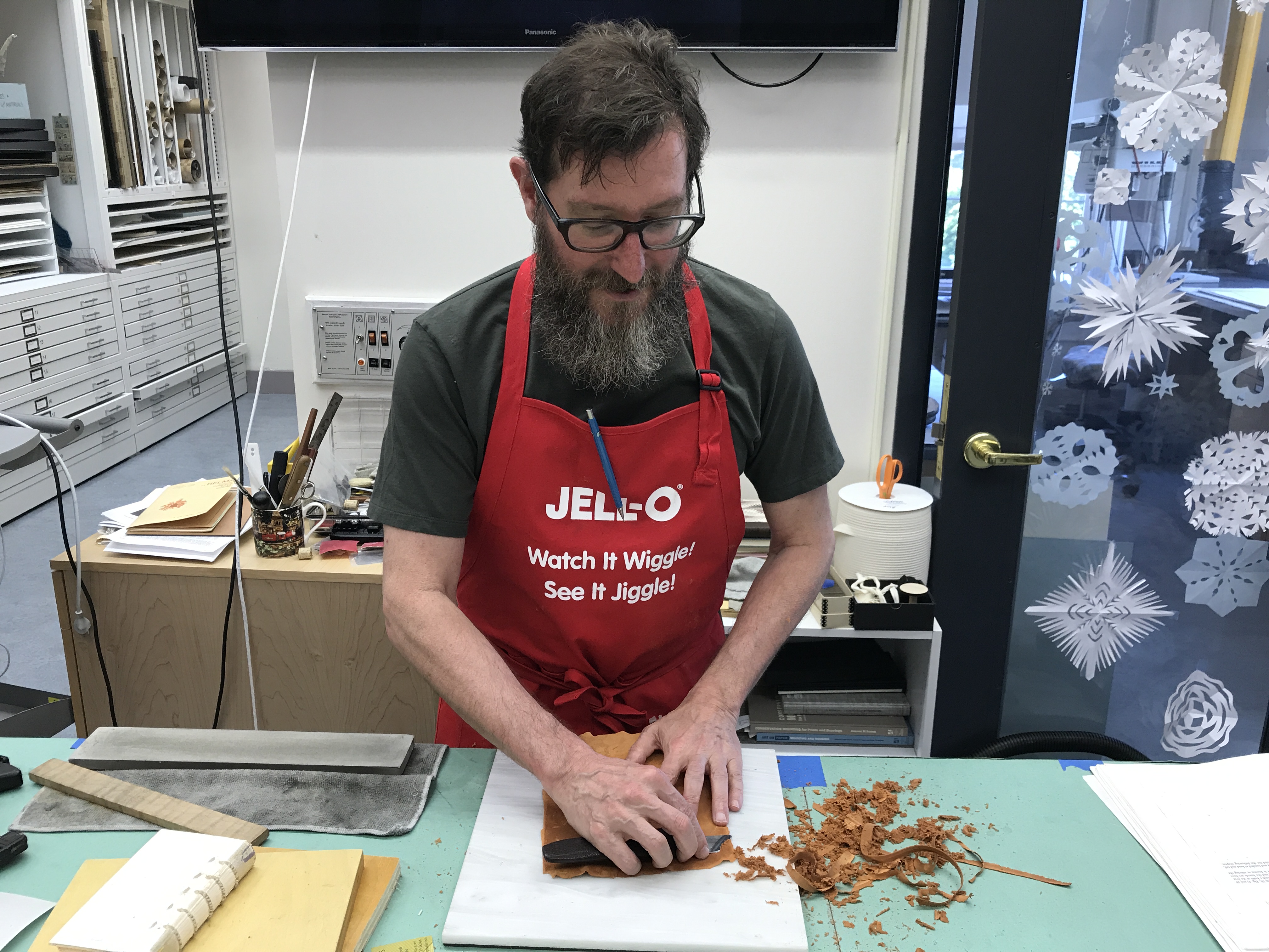
A3: I started making knives almost as soon as I began bookbinding. I (wrongly!) thought cloth binding was too easy, so I started out with leather binding. I quickly grew frustrated with how quickly my knife dulled; it just didn’t make sense to me that I had to spend more time resharpening the knife than using it.
So I started reading and experimenting with different steels and knife types, and for a number of years just made knives for myself and colleagues.
It was really the attack on the World Trade Center in 2001 when I became much more serious about promoting and selling my knives as a business. My conservation work completely died for about six months. Nobody in NYC was thinking about bookbinding, or even picking up books I had ready. At the time I was living in the disaster zone downtown, so one positive result was that FEMA paid for a HEPA vacuum, which I still use. The other was that I got more serious about putting together a catalogue to sell tools nationally, which Peter Verheyen graciously put on his website. I realized I needed to have a source of cash flow outside of NYC.
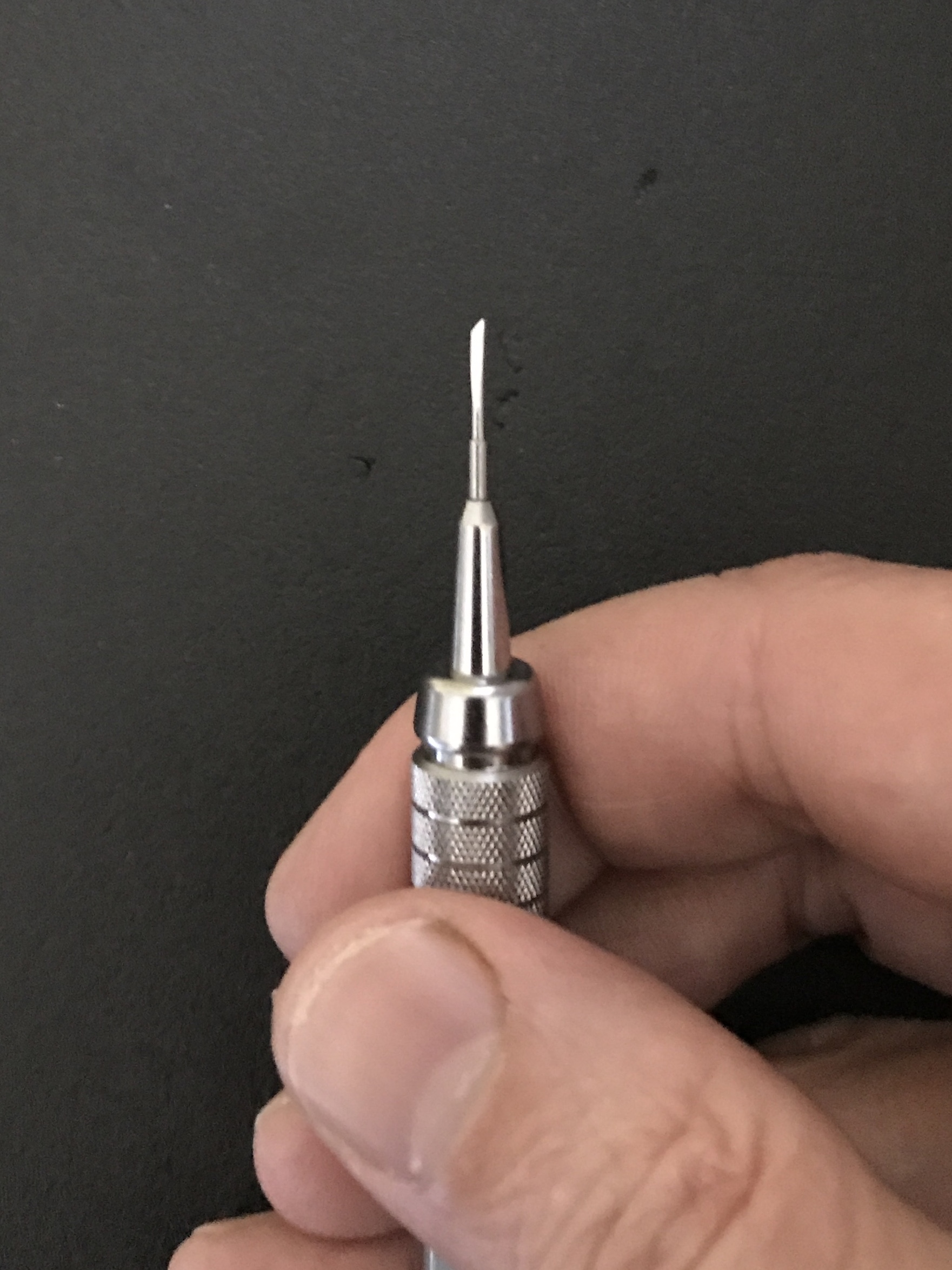
Sales slowly built up for about 15 years, until 2017 when I decided to establish a “real” online store, peacheytools.com. Doing this boosted sales quite a bit, since it is convenient and easy to order, and people didn’t have to deal with me! The newest tools I have come up with are a large Rectangular Burnisher with a Delrin sole, useful for smoothing large work, a Bookbinders’ Pliers, which is great for sewing and board reattachment, and a .9mm micro-knife for extremely precise work. I think it would be great for paper cutting. The blade fits into a standard mechanical pencil.
Q4:You always have interesting content on your website and on Instagram. When did you first put your work online and has your approach changed from when you started?
A4:Thanks! I started by blog in 2008 and just got on Instagram just this year. I have over 500 blog posts and well over a million views. My all time number one post is my instructional “How to Strop”.
Originally I started my blog as an easy way to make an online portfolio for conservation work, and sell some tools. But it has become a good way for prospective clients to get a sense of my approach to conservation and tools. It also helps keep some people away, since they realize by reading a bit that I don’t really do that much more new or design bookbinding, instead concentrate on repair and conservation. It also gives me a chance for me to try out some ideas relating to my current research interests. The danger always is that writing a blog is pretty quick and easy, so it can take away from the sustained energy necessary for more formal publication. Currently I’m working on a big project about early nineteenth century English and American bookbinding.
I’m still trying to figure out how Instagram will work for me. I find it a little frustrating, since it is a self contained ecosystem, and limited in the links you can add. But I’ve been putting up some images of mainly interesting tools I have seen or made. I like how international it is, since it is largely visual rather than verbal.
Q5: I notice you teach a lot of workshops around the country. How does this integrate with your conservation work and toolmaking?
A5: Great question! I often spend around 6 weeks each year teaching on the road, nationally and internationally. I really enjoy it for a number of reasons. The most selfish one is that I work alone most of the time, so teaching gives me a great chance to talk a lot about all the things I am passionate about: book, tools, and craft. And it gets me out of the studio a bit and travel! A less selfish reason is that I want to give back to the craft of bookbinding, in an attempt to try to repay all the people who have taught me formally and informally. I want to contribute positively to the vitality, skill level, and sustainability of bookbinding as a craft. For me, bookbinding is a great way to approach all kinds of interesting practical and historical craft questions, as well as a way to explore many various materials.
This past summer, I taught my all time favorite class, which is now called “Historical Book Structures Practicum”, for graduate Book Conservation students from Buffalo State, New York University, and Winterthur/ University of Delaware. For the entire month of June, we immerse ourselves in a variety of historical book structures ranging form the early 16th century to the mid-19th. This year we made six models. The month is so intense and involved it goes by in an instant. Part of the workshop involves going to a lot of flea markets and antique malls to conduct primary research on tools. We also dip our toes into tool making and restoration.
I’ve always been the kind of person who generally likes to work alone, though, so the combination of teaching, conservation work, and toolmaking is working out so far. I feel lucky!
Here .a pdf of the formatted interview: